UX for destructive actions of varying impact.
Easily undone and not immediately applied (on the frontend)
Destructive actions that are easily undone (e.g. via ‘Undo’ action) require no additional styling or user input.
Example
Deleting a block in a post is only applied when the post is published or saved.

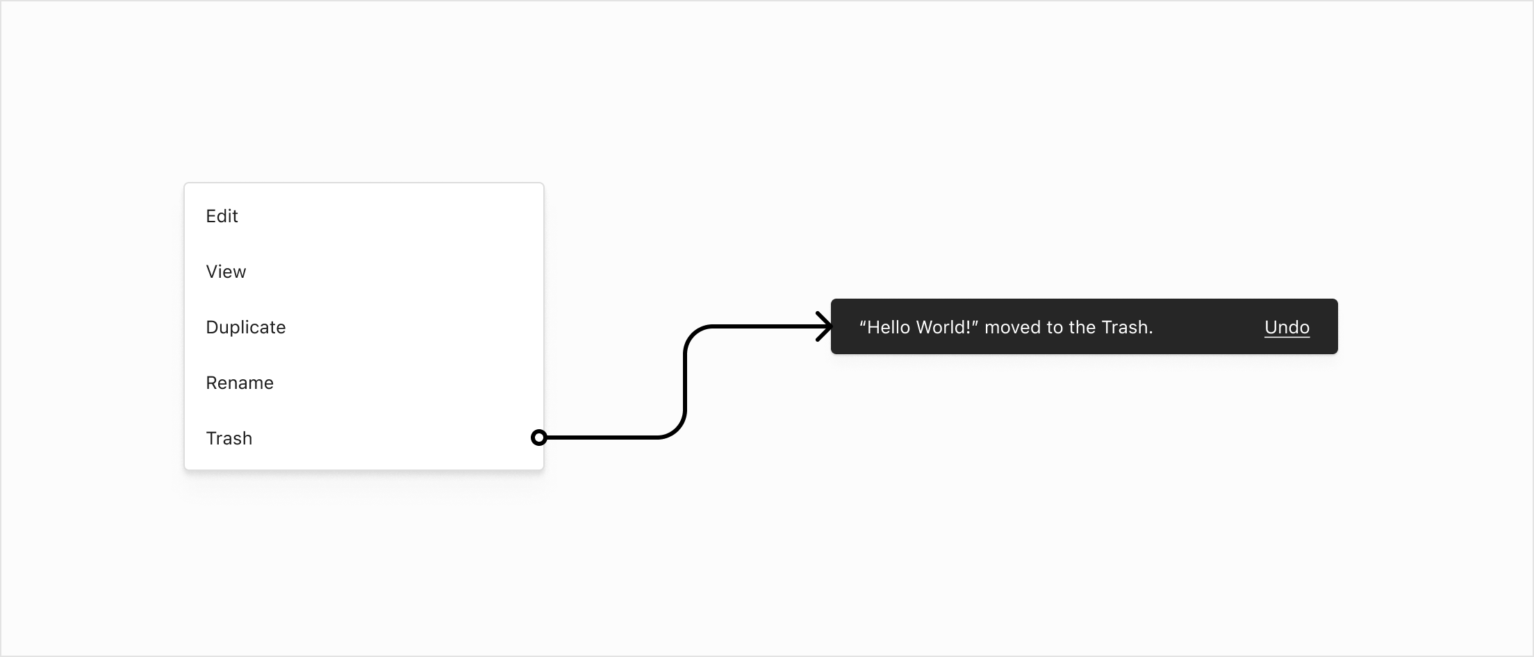
Immediately applied (on the frontend), can be undone
When a destructive action has an immediate effect, a Snackbar confirms the action and should include an Undo affordance wherever possible.
Example
Moving a post to the Trash immediately affects the frontend of the site, but can be undone via the Snackbar action, or by restoring from Trash.
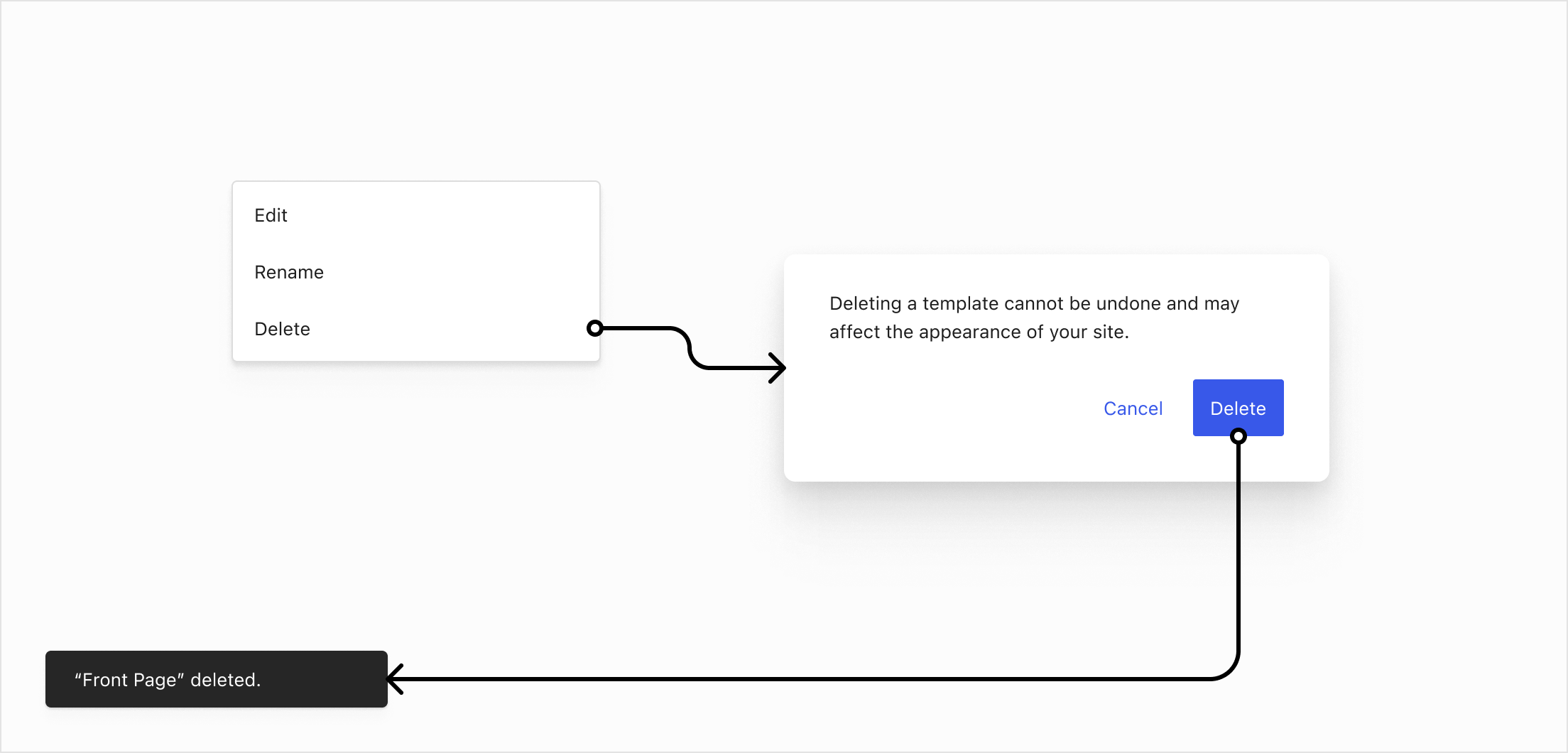
Irreversible
If a destructive action cannot be undone in the UI then the user is asked to confirm the action via Modal or ConfirmDialog. In extreme cases it can be beneficial to include an additional confirmation mechanism like a checkbox.
Example
Deleting a template.
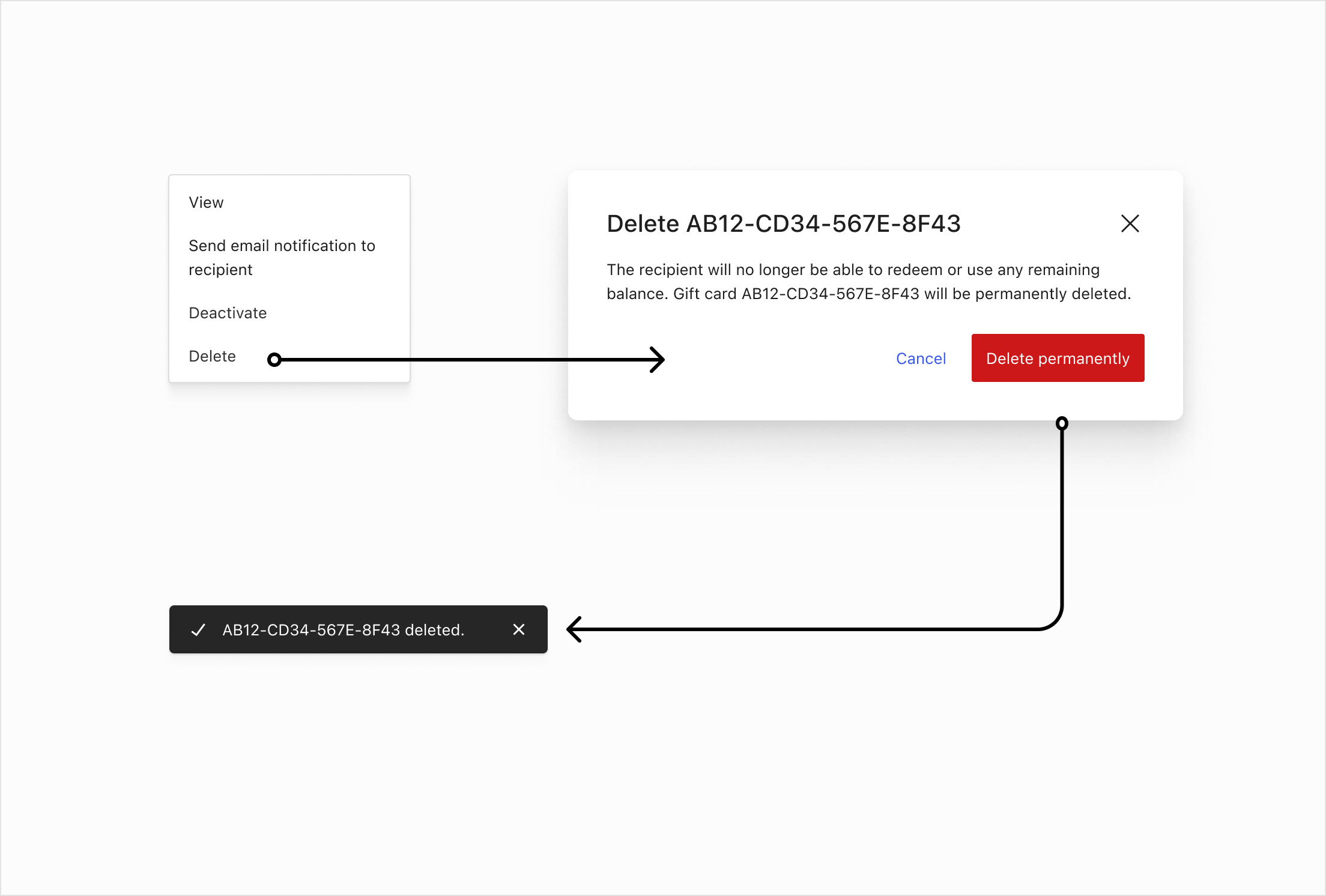
Example
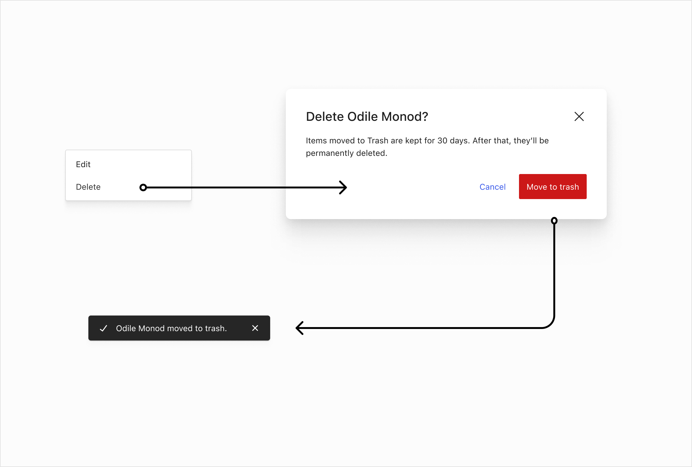
Deleting a gift card permanently, moving a customer to trash. These flows are relevant for other areas like products, orders, coupons and others.
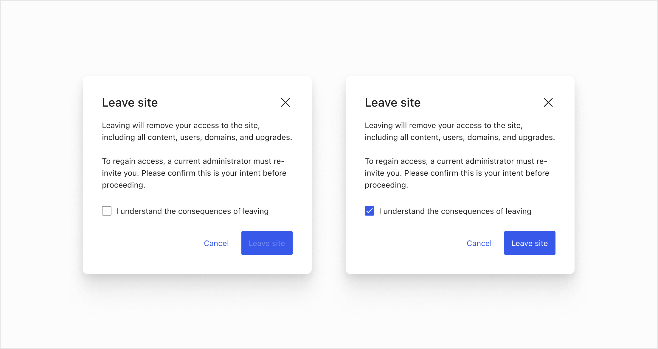
Example
The ‘Leave site” action (a WordPress.com feature) requires the user to toggle a checkbox otherwise the submit button is disabled.
On color
While some UIs use red to indicate destructive actions, we intentionally avoid relying on color alone for this purpose. There are several reasons for this decision:
- Accessibility: Not all users can perceive color differences due to color blindness or other visual impairments.
- Cultural variation: Red does not universally signify danger or caution; its meaning varies across cultures.
- Consistency and clarity: Relying solely on color can lead to ambiguity. We aim for clear labels, iconography, and confirmation patterns to ensure the gravity of destructive actions are understood.
- Future flexibility: Avoiding strict color associations allows the system to adapt more easily to theme variations, dark modes, and brand palettes.
Instead of relying on color, destructive actions are communicated through explicit language, iconography, and confirmation steps to minimize accidental triggers and ensure clarity for all users.