The Automattic Design System is a set of packages used together to build products.
Each package typically has a corresponding Figma library to utilize, and a Storybook instance where documentation can be found.
Core packages
Maintained in the Gutenberg GitHub repository. Provides foundational building blocks used to build WordPress software and other products in the ecosystem.
Public
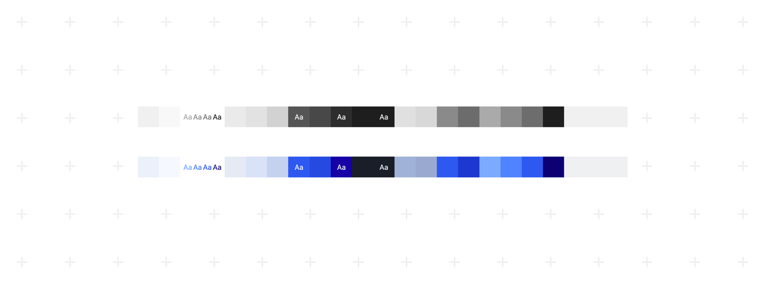
The Theme package defines the foundational design tokens used across the system. It contains semantic variables for color, typography, spacing, radius, and elevation.

Public
The UI package contains the core, reusable design system components. These are product-agnostic primitives such as buttons, inputs, form controls, notices, and overlays, built entirely on Theme tokens and system icons.
Public
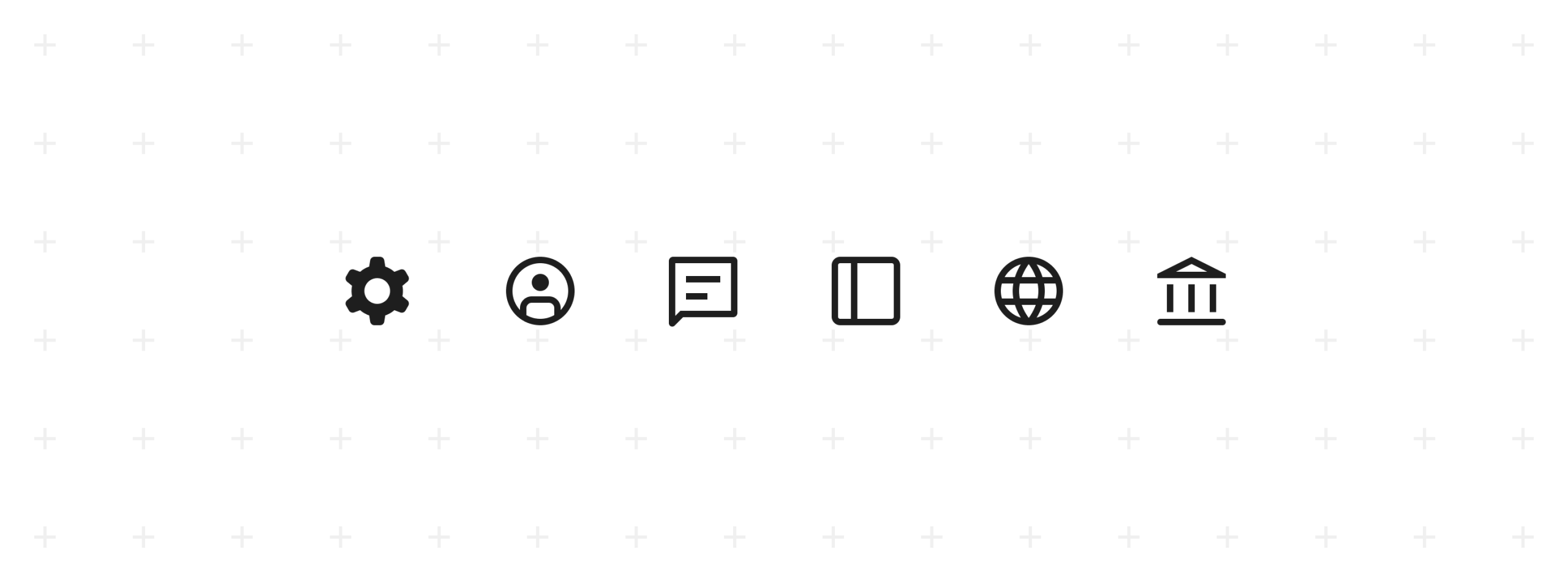
The Icons package provides the system icon set as reusable components. Icons follow a consistent grid, stroke, and visual style, and are designed to be used within UI components and product interfaces. The package focuses solely on iconography and avoids layout or product-specific assumptions.
Public
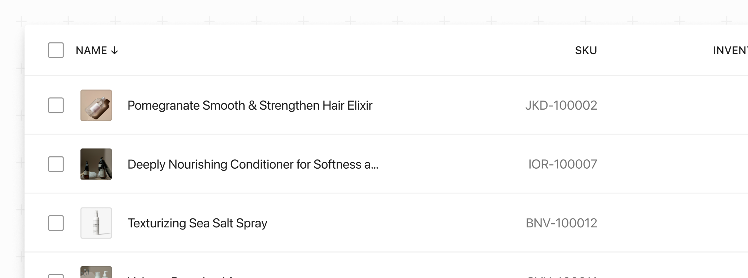
The DataViews package contains higher-level patterns for presenting and interacting with structured data. This includes components and compositions such as tables, filters, pagination, empty states, and bulk actions, plus abstractions like DataForm and DataViewsPicker. DataViews express common data-heavy interface patterns without product-specific logic.

Public
Built on top of @wordpress/ui and @wordpress/theme, this package offers patterns for assembling admin page layouts.
Other packages
These packages are not part of the design system’s components or theming, but provide additional support for building UIs and working with the design system.
Public
An MCP (Model Context Protocol) server for the WordPress Design System. Provides AI coding agents with component documentation, prop definitions, usage examples, and design tokens.
Public
An original set of low-level UI components created to serve the block editor packages. This package will be replaced by @wordpress/ui over time.
Public
Extends @wordpress/components to build patterns for use in Editor design tools.
FAQ
Typically product designers should include the @wordpress/ui, @wordpress/dataviews, and @wordpress/admin-ui libraries in working files.
If you’re working on a system level feature you may want to include @wordpress/theme and @wordpress/icons as well.
Documentation lives in Storybook. You can find links to the Storybook instances associated with each package above.
Development for the public packages takes place in the Gutenberg repository on GitHub. For bug fixes, new features, or other enhancements please open an issue or a pull request. If you’re unsure come visit us in Slack.