Category: Forms

  • RadioControl

    RadioControl

    Render a user interface to select the user type using radio inputs.

    import { RadioControl } from '@wordpress/components';
    

    View on Storybook

    View in Figma

    View source on GitHub

    Examples

    Default

    const Default = () => {
        const [ value, setValue ] = useState( options?.[ 0 ]?.value );
    
        return (
            <RadioControl
                label="Post visibility"
                selected={ value }
                options={ options }
                onChange={ ( v ) => {
    				setValue( v );
    				onChange( v );
    			} } />
        );
    };
    

    With Option Descriptions

    const WithOptionDescriptions = () => {
        const [ value, setValue ] = useState( options?.[ 0 ]?.value );
    
        return (
            <RadioControl
                selected={ value }
                options={ options }
                onChange={ ( v ) => {
    				setValue( v );
    				onChange( v );
    			} } />
        );
    };
    
  • BaseControl

    BaseControl

    import { BaseControl } from '@wordpress/components';
    

    View on Storybook

    View source on GitHub

    Examples

    Default

    const Default = ( props ) => {
    	const { baseControlProps, controlProps } = useBaseControlProps( props );
    
    	return (
    		<BaseControl { ...baseControlProps }>
    			<textarea style={ { display: 'block' } } { ...controlProps } />
    		</BaseControl>
    	);
    };
    

    With Help Text

    const WithHelpText = ( props ) => {
    	const { baseControlProps, controlProps } = useBaseControlProps( props );
    
    	return (
    		<BaseControl { ...baseControlProps }>
    			<textarea style={ { display: 'block' } } { ...controlProps } />
    		</BaseControl>
    	);
    };
    

    With Visual Label

    BaseControl.VisualLabel is used to render a purely visual label inside a BaseControl component. It should only be used in cases where the children being rendered inside BaseControl are already accessibly labeled, e.g., a button, but we want an additional visual label for that section equivalent to the labels BaseControl would otherwise use if the label prop was passed.

    const WithVisualLabel = ( props ) => {
    	BaseControl.VisualLabel.displayName = 'BaseControl.VisualLabel';
    
    	return (
    		<BaseControl { ...props }>
    			<BaseControl.VisualLabel>Visual label</BaseControl.VisualLabel>
    			<div>
    				<Button __next40pxDefaultSize variant="secondary">
    					Select an author
    				</Button>
    			</div>
    		</BaseControl>
    	);
    };
    
  • CheckboxControl

    CheckboxControl

    Checkboxes allow the user to select one or more items from a set.

    import { CheckboxControl } from '@wordpress/components';
    

    View on Storybook

    View in Figma

    View source on GitHub

    Examples

    Default

    const Default = () => {
        const [ isChecked, setChecked ] = useState( true );
    
        return (
            <CheckboxControl
                label="Is author"
                help="Is the user an author or not?"
                checked={ isChecked }
                onChange={ ( v ) => {
    				setChecked( v );
    				onChange( v );
    			} } />
        );
    };
    

    Indeterminate

    const Indeterminate = () => {
        const [ fruits, setFruits ] = useState( { apple: false, orange: false } );
    
        const isAllChecked = Object.values( fruits ).every( Boolean );
        const isIndeterminate =
    		Object.values( fruits ).some( Boolean ) && ! isAllChecked;
    
        return (
            <VStack>
                <CheckboxControl
                    label="Select all"
                    checked={ isAllChecked }
                    indeterminate={ isIndeterminate }
                    onChange={ ( v ) => {
    					setFruits( {
    						apple: v,
    						orange: v,
    					} );
    					onChange( v );
    				} } />
                <CheckboxControl
                    label="Apple"
                    checked={ fruits.apple }
                    onChange={ ( apple ) =>
    					setFruits( ( prevState ) => ( {
    						...prevState,
    						apple,
    					} ) )
    				} />
                <CheckboxControl
                    label="Orange"
                    checked={ fruits.orange }
                    onChange={ ( orange ) =>
    					setFruits( ( prevState ) => ( {
    						...prevState,
    						orange,
    					} ) )
    				} />
            </VStack>
        );
    };
    

    With Custom Label

    For more complex designs, a custom <label> element can be associated with the checkbox by leaving the label prop undefined and using the id and htmlFor props instead. Because the label element also functions as a click target for the checkbox, do not place interactive elements such as links or buttons inside the <label> node. Similarly, a custom description can be added by omitting the help prop and using the aria-describedby prop instead.

    const WithCustomLabel = () => {
        const [ isChecked, setChecked ] = useState( true );
    
        return (
            <HStack justify="flex-start" alignment="top" spacing={ 0 }>
                <CheckboxControl
                    checked={ isChecked }
                    onChange={ ( v ) => {
    					setChecked( v );
    					onChange( v );
    				} }
                    // Disable reason: For simplicity of the code snippet.
                    // eslint-disable-next-line no-restricted-syntax
                    id="my-checkbox-with-custom-label"
                    aria-describedby="my-custom-description" />
                <VStack>
                    <label htmlFor="my-checkbox-with-custom-label">My custom label
                                        </label>
                    { /* eslint-disable-next-line no-restricted-syntax */ }
                    <div id="my-custom-description" style={ { fontSize: 13 } }>A custom description.
                                        </div>
                </VStack>
            </HStack>
        );
    };
    
  • ColorIndicator

    ColorIndicator

    ColorIndicator is a React component that renders a specific color in a circle. It’s often used to summarize a collection of used colors in a child component.

    import { ColorIndicator } from '@wordpress/components';
    

    View on Storybook

    View source on GitHub

    Examples

    Default

    const Default = () => <ColorIndicator colorValue="#0073aa" />;
    
  • ColorPalette

    ColorPalette

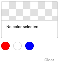
    Allows the user to pick a color from a list of pre-defined color entries.

    import { ColorPalette } from '@wordpress/components';
    

    View on Storybook

    View in Figma

    View source on GitHub

    Examples

    Default

    const Default = () => {
        const [ color, setColor ] = useState< string | undefined >( value );
        const [ slug, setSlug ] = useState< string | undefined >( selectedSlug );
    
        return (
            <ColorPalette
                colors={[
                    { name: 'Red', color: '#f00' },
                    { name: 'White', color: '#fff' },
                    { name: 'Blue', color: '#00f' },
                ]}
                value={ color }
                selectedSlug={ slug }
                onChange={ ( newColor, index, newSlug ) => {
    				setColor( newColor );
    				setSlug( newSlug );
    				onChange?.( newColor, index, newSlug );
    			} } />
        );
    };
    

    Initial Value

    const InitialValue = () => {
        const [ color, setColor ] = useState< string | undefined >( value );
        const [ slug, setSlug ] = useState< string | undefined >( selectedSlug );
    
        return (
            <ColorPalette
                colors={[
                    { name: 'Red', color: '#f00' },
                    { name: 'White', color: '#fff' },
                    { name: 'Blue', color: '#00f' },
                ]}
                value={ color }
                selectedSlug={ slug }
                onChange={ ( newColor, index, newSlug ) => {
    				setColor( newColor );
    				setSlug( newSlug );
    				onChange?.( newColor, index, newSlug );
    			} } />
        );
    };
    

    Multiple Origins

    const MultipleOrigins = () => {
        const [ color, setColor ] = useState< string | undefined >( value );
        const [ slug, setSlug ] = useState< string | undefined >( selectedSlug );
    
        return (
            <ColorPalette
                colors={[
                    {
                        name: 'Primary colors',
                        colors: [
                            { name: 'Red', color: '#f00' },
                            { name: 'Yellow', color: '#ff0' },
                            { name: 'Blue', color: '#00f' },
                        ],
                    },
                    {
                        name: 'Secondary colors',
                        colors: [
                            { name: 'Orange', color: '#f60' },
                            { name: 'Green', color: '#0f0' },
                            { name: 'Purple', color: '#60f' },
                        ],
                    },
                ]}
                value={ color }
                selectedSlug={ slug }
                onChange={ ( newColor, index, newSlug ) => {
    				setColor( newColor );
    				setSlug( newSlug );
    				onChange?.( newColor, index, newSlug );
    			} } />
        );
    };
    

    Duplicate Colors

    const DuplicateColors = () => {
        const [ color, setColor ] = useState< string | undefined >( value );
        const [ slug, setSlug ] = useState< string | undefined >( selectedSlug );
    
        return (
            <ColorPalette
                colors={[
                    { name: 'Dark Background', slug: 'dark-background', color: '#000' },
                    { name: 'Dark Text', slug: 'dark-text', color: '#000' },
                    { name: 'Brand', slug: 'brand', color: '#0073aa' },
                ]}
                value={ color }
                selectedSlug={ slug }
                onChange={ ( newColor, index, newSlug ) => {
    				setColor( newColor );
    				setSlug( newSlug );
    				onChange?.( newColor, index, newSlug );
    			} } />
        );
    };
    

    CSS Variables

    const CSSVariables = () => <div
        style={ {
            '--red': '#f00',
            '--yellow': '#ff0',
            '--blue': '#00f',
        } }>
        <Template
            colors={[
    			{ name: 'Red', color: 'var(--red)' },
    			{ name: 'Yellow', color: 'var(--yellow)' },
    			{ name: 'Blue', color: 'var(--blue)' },
    		]} />
    </div>;
    
  • ColorPicker

    ColorPicker

    import { ColorPicker } from '@wordpress/components';
    

    View on Storybook

    View in Figma

    View source on GitHub

    Examples

    Default

    const Default = () => <ColorPicker onChange={fn()} />;
    
  • ComboboxControl

    ComboboxControl

    ComboboxControl is an enhanced version of a SelectControl with the addition of being able to search for options using a search input.

    import { ComboboxControl } from '@wordpress/components';
    

    View on Storybook

    View in Figma

    View source on GitHub

    Props

    NameDefaultDescription
    __experimentalRenderItem

    ( args: { item: ComboboxControlOption; } ) => React.ReactNode

    Custom renderer invoked for each option in the suggestion list. The render prop receives as its argument an object containing, under the item key, the single option’s data (directly from the array of data passed to the options prop).

    __next40pxDefaultSize

    boolean

    Start opting into the larger default height that will become the default size in a future version.

    allowReset

    boolean

    Show a reset button to clear the input.

    expandOnFocus

    boolean

    Automatically expand the dropdown when the control is focused. If the control is clicked, the dropdown will expand regardless of this prop.

    messages

    { /** * The message to announce to screen readers when a suggestion is selected. * * @default `__( 'Item selected.' )` */ selected: string; }

    Customizable UI messages.

    onChange

    ( value: ComboboxControlProps[ 'value' ] ) => void

    Function called with the selected value changes.

    onFilterValueChange

    ( value: string ) => void

    Function called when the control’s search input value changes. The argument contains the next input value.

    options Required

    ComboboxControlOption[]

    The options that can be chosen from.

    value

    string | null

    The current value of the control.

    placeholder

    string

    If passed, the combobox input will show a placeholder string if no values are present.

    isLoading

    boolean

    Show a spinner (and hide the suggestions dropdown) while data about the matching suggestions (ie the options prop) is loading

    Examples

    Default

    const Default = () => {
        const [ value, setValue ] =
    		useState< ComboboxControlProps[ 'value' ] >( null );
    
        return (
            <>
                <ComboboxControl
                    __next40pxDefaultSize
                    onFilterValueChange={fn()}
                    label="Country"
                    options={countryOptions}
                    help="Help text to describe the control."
                    value={ value }
                    onChange={ ( ...changeArgs ) => {
    					setValue( ...changeArgs );
    					onChange?.( ...changeArgs );
    				} } />
            </>
        );
    };
    

    With Custom Render Item

    The rendered output of each suggestion can be customized by passing a render function to the __experimentalRenderItem prop. (This is still an experimental feature and is subject to change.)

    const WithCustomRenderItem = () => {
        const [ value, setValue ] =
    		useState< ComboboxControlProps[ 'value' ] >( null );
    
        return (
            <>
                <ComboboxControl
                    __next40pxDefaultSize
                    onFilterValueChange={fn()}
                    label="Author"
                    options={[
                        {
                            value: 'parsley',
                            label: 'Parsley Montana',
                            age: 48,
                            country: 'Germany',
                        },
                        {
                            value: 'cabbage',
                            label: 'Cabbage New York',
                            age: 44,
                            country: 'France',
                        },
                        {
                            value: 'jake',
                            label: 'Jake Weary',
                            age: 41,
                            country: 'United Kingdom',
                        },
                    ]}
                    __experimentalRenderItem={( { item } ) => {
                        const { label, age, country } = item;
                        return (
                            <div>
                                <div style={ { marginBottom: '0.2rem' } }>{ label }</div>
                                <small>
                                    Age: { age }, Country: { country }
                                </small>
                            </div>
                        );
                    }}
                    value={ value }
                    onChange={ ( ...changeArgs ) => {
    					setValue( ...changeArgs );
    					onChange?.( ...changeArgs );
    				} } />
            </>
        );
    };
    

    With Disabled Options

    You can disable options in the list by setting the disabled property to true for individual items in the option object.

    const WithDisabledOptions = () => {
        const [ value, setValue ] =
    		useState< ComboboxControlProps[ 'value' ] >( null );
    
        return (
            <>
                <ComboboxControl
                    __next40pxDefaultSize
                    onFilterValueChange={fn()}
                    options={optionsWithDisabledOptions}
                    value={ value }
                    onChange={ ( ...changeArgs ) => {
    					setValue( ...changeArgs );
    					onChange?.( ...changeArgs );
    				} } />
            </>
        );
    };
    

    Not Expand On Focus

    By default, the combobox expands when focused. You can disable this behavior by setting the expandOnFocus prop to false. This is useful when you want to show the suggestions only when the user interacts with the input.

    const NotExpandOnFocus = () => {
        const [ value, setValue ] =
    		useState< ComboboxControlProps[ 'value' ] >( null );
    
        return (
            <>
                <ComboboxControl
                    __next40pxDefaultSize
                    onFilterValueChange={fn()}
                    options={countryOptions}
                    expandOnFocus={false}
                    value={ value }
                    onChange={ ( ...changeArgs ) => {
    					setValue( ...changeArgs );
    					onChange?.( ...changeArgs );
    				} } />
            </>
        );
    };
    
  • CustomSelectControl

    CustomSelectControl

    import { CustomSelectControl } from '@wordpress/components';
    

    View on Storybook

    View source on GitHub

    Props

    NameDefaultDescription
    className

    string

    Optional classname for the component.

    hideLabelFromVision

    boolean

    Hide the label visually, while keeping available to assistive technology.

    describedBy

    string

    Description for the select trigger button used by assistive technology. If no value is passed, the text “Currently selected: selectedItem.name” will be used fully translated.

    label Required

    string

    Label for the control.

    onChange

    ( newValue: CustomSelectChangeObject< NoInfer< T > > ) => void

    Function called with the control’s internal state changes. The selectedItem property contains the next selected item.

    options Required

    ReadonlyArray< T >

    The list of options that can be chosen from.

    size

    'default' | 'small' | '__unstable-large'

    The size of the control.

    value

    NoInfer< T >

    Can be used to externally control the value of the control.

    showSelectedHint

    boolean

    Show the hint of the selected item in the trigger button.

    __next40pxDefaultSize

    boolean

    Start opting into the larger default height that will become the default size in a future version.

    Examples

    Default

    const Default = ( props ) => {
    	const [ value, setValue ] = useState( props.options[ 0 ] );
    
    	const onChange: React.ComponentProps<
    		typeof CustomSelectControl
    	>[ 'onChange' ] = ( changeObject ) => {
    		setValue( changeObject.selectedItem );
    		props.onChange?.( changeObject );
    	};
    
    	return (
    		<CustomSelectControl
    			__next40pxDefaultSize
    			{ ...props }
    			onChange={ onChange }
    			value={ value }
    		/>
    	);
    };
    

    With Long Labels

    const WithLongLabels = ( props ) => {
    	const [ value, setValue ] = useState( props.options[ 0 ] );
    
    	const onChange: React.ComponentProps<
    		typeof CustomSelectControl
    	>[ 'onChange' ] = ( changeObject ) => {
    		setValue( changeObject.selectedItem );
    		props.onChange?.( changeObject );
    	};
    
    	return (
    		<CustomSelectControl
    			__next40pxDefaultSize
    			{ ...props }
    			onChange={ onChange }
    			value={ value }
    		/>
    	);
    };
    

    With Hints

    const WithHints = ( props ) => {
    	const [ value, setValue ] = useState( props.options[ 0 ] );
    
    	const onChange: React.ComponentProps<
    		typeof CustomSelectControl
    	>[ 'onChange' ] = ( changeObject ) => {
    		setValue( changeObject.selectedItem );
    		props.onChange?.( changeObject );
    	};
    
    	return (
    		<CustomSelectControl
    			__next40pxDefaultSize
    			{ ...props }
    			onChange={ onChange }
    			value={ value }
    		/>
    	);
    };
    
  • DropZone

    DropZone

    DropZone is a component creating a drop zone area taking the full size of its parent element. It supports dropping files, HTML content or any other HTML drop event.

    import { DropZone } from '@wordpress/components';
    

    View on Storybook

    View in Figma

    View source on GitHub

    Props

    NameDefaultDescription
    iconjsx(SVG, { xmlns: "http://www.w3.org/2000/svg", viewBox: "0 0 24 24", children: /* @__PURE__ */ jsx(Path, { d: "M18.5 15v3.5H13V6.7l4.5 4.1 1-1.1-6.2-5.8-5.8 5.8 1 1.1 4-4v11.7h-6V15H4v5h16v-5z" }) })

    unknown

    isEligible() => true

    unknown

    Examples

    Default

    const Default = ( props ) => {
    	return (
    		<div
    			style={ {
    				background: 'lightgray',
    				padding: 32,
    				position: 'relative',
    			} }
    		>
    			Drop something here
    			<DropZone { ...props } />
    		</div>
    	);
    };
    
  • FormFileUpload

    FormFileUpload

    FormFileUpload allows users to select files from their local device.

    import { FormFileUpload } from '@wordpress/components';
    

    View on Storybook

    View in Figma

    View source on GitHub

    Props

    NameDefaultDescription
    multiplefalse

    unknown

    Examples

    Default

    const Default = ( props ) => {
    	return <FormFileUpload __next40pxDefaultSize { ...props } />;
    };
    

    Restrict File Types

    const RestrictFileTypes = ( props ) => {
    	return <FormFileUpload __next40pxDefaultSize { ...props } />;
    };
    

    Allow Multiple Files

    const AllowMultipleFiles = ( props ) => {
    	return <FormFileUpload __next40pxDefaultSize { ...props } />;
    };
    

    With Icon

    const WithIcon = ( props ) => {
    	return <FormFileUpload __next40pxDefaultSize { ...props } />;
    };
    

    With Custom Render

    Render a custom trigger button by passing a render function to the render prop. jsx ( { openFileDialog } ) => <button onClick={ openFileDialog }>Custom Upload Button</button>

    const WithCustomRender = ( props ) => {
    	return <FormFileUpload __next40pxDefaultSize { ...props } />;
    };