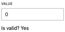
RangeControls are used to make selections from a range of incremental values.
import { RangeControl } from '@wordpress/components';
Links
 View on Storybook
 View in Figma
 View source on GitHub
Examples
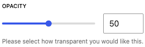
Default
const Default = () => {
    const [ value, setValue ] = useState< number >();

    return (
        <RangeControl
            __next40pxDefaultSize
            onBlur={fn()}
            onFocus={fn()}
            onMouseLeave={fn()}
            onMouseMove={fn()}
            help="Please select how transparent you would like this."
            initialPosition={50}
            label="Opacity"
            max={100}
            min={0}
            value={ value }
            onChange={ ( v ) => {
				setValue( v );
				onChange?.( v );
			} } />
    );
};
With Any Step
Setting the step prop to "any" will allow users to select non-integer values. This also overrides both withInputField and showTooltip props to false.
const WithAnyStep = () => {
    const [ value, setValue ] = useState< number >();

    return (
        <>
            <RangeControl
                __next40pxDefaultSize
                onBlur={fn()}
                onFocus={fn()}
                onMouseLeave={fn()}
                onMouseMove={fn()}
                label="Brightness"
                step="any"
                value={ value }
                onChange={ ( v ) => {
					setValue( v );
					onChange?.( v );
				} } />
            <hr style={ { marginTop: '5em' } } />
            <p>Current value: { value }</p>
        </>
    );
};
With Integer Step And Marks
Use marks to render a visual representation of step ticks. Marks may be automatically generated or custom mark indicators can be provided by an Array.
const WithIntegerStepAndMarks = () => {
    const [ automaticValue, setAutomaticValue ] = useState< number >();
    const [ customValue, setCustomValue ] = useState< number >();

    return (
        <>
            <h2>{ label }</h2>
            <RangeControl
                __next40pxDefaultSize
                onBlur={fn()}
                onFocus={fn()}
                onMouseLeave={fn()}
                onMouseMove={fn()}
                max={10}
                min={0}
                step={1}
                label="Automatic marks"
                marks
                onChange={ ( v ) => {
					setAutomaticValue( v );
					onChange?.( v );
				} }
                value={ automaticValue } />
            <RangeControl
                __next40pxDefaultSize
                onBlur={fn()}
                onFocus={fn()}
                onMouseLeave={fn()}
                onMouseMove={fn()}
                marks={marksBase}
                max={10}
                min={0}
                step={1}
                label="Custom marks"
                onChange={ ( v ) => {
					setCustomValue( v );
					onChange?.( v );
				} }
                value={ customValue } />
        </>
    );
};
With Decimal Step And Marks
Decimal values may be used for marks rendered as a visual representation of step ticks. Marks may be automatically generated or custom mark indicators can be provided by an Array.
const WithDecimalStepAndMarks = () => {
    const [ automaticValue, setAutomaticValue ] = useState< number >();
    const [ customValue, setCustomValue ] = useState< number >();

    return (
        <>
            <h2>{ label }</h2>
            <RangeControl
                __next40pxDefaultSize
                onBlur={fn()}
                onFocus={fn()}
                onMouseLeave={fn()}
                onMouseMove={fn()}
                max={10}
                min={0}
                step={0.1}
                label="Automatic marks"
                marks
                onChange={ ( v ) => {
					setAutomaticValue( v );
					onChange?.( v );
				} }
                value={ automaticValue } />
            <RangeControl
                __next40pxDefaultSize
                onBlur={fn()}
                onFocus={fn()}
                onMouseLeave={fn()}
                onMouseMove={fn()}
                marks={[
                    ...marksBase,
                    { value: 3.5, label: '3.5' },
                    { value: 5.8, label: '5.8' },
                ]}
                max={10}
                min={0}
                step={0.1}
                label="Custom marks"
                onChange={ ( v ) => {
					setCustomValue( v );
					onChange?.( v );
				} }
                value={ customValue } />
        </>
    );
};
With Negative Minimum And Marks
A negative min value can be used to constrain RangeControl values. Mark indicators can represent negative values as well. Marks may be automatically generated or custom mark indicators can be provided by an Array.
const WithNegativeMinimumAndMarks = () => {
    const [ automaticValue, setAutomaticValue ] = useState< number >();
    const [ customValue, setCustomValue ] = useState< number >();

    return (
        <>
            <h2>{ label }</h2>
            <RangeControl
                __next40pxDefaultSize
                onBlur={fn()}
                onFocus={fn()}
                onMouseLeave={fn()}
                onMouseMove={fn()}
                max={10}
                min={-10}
                step={1}
                label="Automatic marks"
                marks
                onChange={ ( v ) => {
					setAutomaticValue( v );
					onChange?.( v );
				} }
                value={ automaticValue } />
            <RangeControl
                __next40pxDefaultSize
                onBlur={fn()}
                onFocus={fn()}
                onMouseLeave={fn()}
                onMouseMove={fn()}
                marks={marksWithNegatives}
                max={10}
                min={-10}
                step={1}
                label="Custom marks"
                onChange={ ( v ) => {
					setCustomValue( v );
					onChange?.( v );
				} }
                value={ customValue } />
        </>
    );
};
With Negative Range And Marks
The entire range of valid values for a RangeControl may be negative. Mark indicators can represent negative values as well. Marks may be automatically generated or custom mark indicators can be provided by an Array.
const WithNegativeRangeAndMarks = () => {
    const [ automaticValue, setAutomaticValue ] = useState< number >();
    const [ customValue, setCustomValue ] = useState< number >();

    return (
        <>
            <h2>{ label }</h2>
            <RangeControl
                __next40pxDefaultSize
                onBlur={fn()}
                onFocus={fn()}
                onMouseLeave={fn()}
                onMouseMove={fn()}
                max={-1}
                min={-10}
                step={1}
                label="Automatic marks"
                marks
                onChange={ ( v ) => {
					setAutomaticValue( v );
					onChange?.( v );
				} }
                value={ automaticValue } />
            <RangeControl
                __next40pxDefaultSize
                onBlur={fn()}
                onFocus={fn()}
                onMouseLeave={fn()}
                onMouseMove={fn()}
                marks={marksWithNegatives}
                max={-1}
                min={-10}
                step={1}
                label="Custom marks"
                onChange={ ( v ) => {
					setCustomValue( v );
					onChange?.( v );
				} }
                value={ customValue } />
        </>
    );
};
With Any Step And Marks
When a RangeControl has a step value of any a user may select non-integer values. This may still be used in conjunction with marks rendering a visual representation of step ticks.
const WithAnyStepAndMarks = () => {
    const [ automaticValue, setAutomaticValue ] = useState< number >();
    const [ customValue, setCustomValue ] = useState< number >();

    return (
        <>
            <h2>{ label }</h2>
            <RangeControl
                __next40pxDefaultSize
                onBlur={fn()}
                onFocus={fn()}
                onMouseLeave={fn()}
                onMouseMove={fn()}
                max={10}
                min={0}
                step="any"
                label="Automatic marks"
                marks
                onChange={ ( v ) => {
					setAutomaticValue( v );
					onChange?.( v );
				} }
                value={ automaticValue } />
            <RangeControl
                __next40pxDefaultSize
                onBlur={fn()}
                onFocus={fn()}
                onMouseLeave={fn()}
                onMouseMove={fn()}
                marks={marksBase}
                max={10}
                min={0}
                step="any"
                label="Custom marks"
                onChange={ ( v ) => {
					setCustomValue( v );
					onChange?.( v );
				} }
                value={ customValue } />
        </>
    );
};