Category: Feedback

  • Notice

    Notice

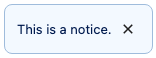
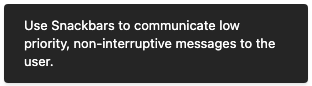
    Notice is a component used to communicate feedback to the user.

    import { Notice } from '@wordpress/components';
    

    View on Storybook

    View in Figma

    View source on GitHub

    Props

    NameDefaultDescription
    className

    string

    A CSS class to give to the wrapper element.

    children Required

    ReactNode

    The displayed message of a notice. Also used as the spoken message for assistive technology, unless spokenMessage is provided as an alternative message.

    spokenMessagechildren

    ReactNode

    Used to provide a custom spoken message in place of the children default.

    status'info'

    'warning' | 'success' | 'error' | 'info'

    Determines the color of the notice: warning (yellow), success (green), error (red), or 'info'. By default 'info' will be blue.

    onRemove() => {}

    () => void

    Function called when dismissing the notice

    politenessgetDefaultPoliteness( status )

    'polite' | 'assertive'

    A politeness level for the notice’s spoken message. Should be provided as one of the valid options for an aria-live attribute value.

    A value of 'assertive' is to be used for important, and usually time-sensitive, information. It will interrupt anything else the screen reader is announcing in that moment. A value of 'polite' is to be used for advisory information. It should not interrupt what the screen reader is announcing in that moment (the “speech queue”) or interrupt the current task.

    Note that this value should be considered a suggestion; assistive technologies may override it based on internal heuristics.

    See: https://www.w3.org/TR/wai-aria-1.1/#aria-live

    isDismissibletrue

    boolean

    Whether the notice should be dismissible or not

    onDismiss() => {}

    () => void

    A deprecated alternative to onRemove. This prop is kept for compatibility reasons but should be avoided.

    actions[]

    Array< NoticeAction >

    An array of action objects. Each member object should contain:

    • label: string containing the text of the button/link
    • url: string OR onClick: ( event: SyntheticEvent ) => void to specify what the action does.
    • className: string (optional) to add custom classes to the button styles.
    • noDefaultClasses: boolean (optional) A value of true will remove all default styling.
    • variant: 'primary' | 'secondary' | 'link' (optional) You can denote a primary button action for a notice by passing a value of primary.

    The default appearance of an action button is inferred based on whether url or onClick are provided, rendering the button as a link if appropriate. If both props are provided, url takes precedence, and the action button will render as an anchor tag.

    __unstableHTML

    boolean

    Determines whether or not the message should be parsed as custom HTML instead of a string.

    Examples

    Default

    const Default = ( props ) => {
    	return <Notice { ...props } />;
    };
    

    With Custom Spoken Message

    const WithCustomSpokenMessage = ( props ) => {
    	return <Notice { ...props } />;
    };
    

    With JSX Children

    const WithJSXChildren = ( props ) => {
    	return <Notice { ...props } />;
    };
    

    With Actions

    const WithActions = ( props ) => {
    	return <Notice { ...props } />;
    };
    

    NoticeList Subcomponent

    const NoticeListSubcomponent = () => {
    	const exampleNotices: NoticeListProps[ 'notices' ] = [
    		{
    			id: 'second-notice',
    			content: 'second notice content',
    		},
    		{
    			id: 'first-notice',
    			content: 'first notice content',
    			actions: [
    				{
    					label: 'Click me!',
    					onClick: () => {},
    					variant: 'primary',
    				},
    				{
    					label: 'Or click me instead!',
    					onClick: () => {},
    				},
    				{
    					label: 'Or visit a link for more info',
    					url: 'https://wordpress.org',
    					variant: 'link',
    				},
    			],
    		},
    	];
    	const [ notices, setNotices ] = useState( exampleNotices );
    
    	const removeNotice = (
    		id: NoticeListProps[ 'notices' ][ number ][ 'id' ]
    	) => {
    		setNotices( notices.filter( ( notice ) => notice.id !== id ) );
    	};
    
    	const resetNotices = () => {
    		setNotices( exampleNotices );
    	};
    
    	return (
    		<>
    			<NoticeList notices={ notices } onRemove={ removeNotice } />
    			<Button
    				__next40pxDefaultSize
    				variant="primary"
    				onClick={ resetNotices }
    			>
    				Reset Notices
    			</Button>
    		</>
    	);
    };
    

    With Disabled Action

    Action buttons can be disabled.

    const WithDisabledAction = ( props ) => {
    	return <Notice { ...props } />;
    };
    
  • ProgressBar

    ProgressBar

    A simple horizontal progress bar component.

    Supports two modes: determinate and indeterminate. A progress bar is determinate when a specific progress value has been specified (from 0 to 100), and indeterminate when a value hasn’t been specified.

    import { ProgressBar } from '@wordpress/components';
    

    View on Storybook

    View in Figma

    View source on GitHub

    Examples

    Default

    const Default = () => {
        return <ProgressBar />;
    };
    

    With Custom Width

    A progress bar with a custom width. You can override the default width by passing a custom CSS class via the className prop. This example shows a progress bar with an overridden width of 100% which makes it fit all available horizontal space of the parent element. The CSS class looks like this: css .custom-progress-bar { width: 100%; }

    const WithCustomWidth = () => {
        return <ProgressBar className="custom-progress-bar" />;
    };
    
  • Snackbar

    Snackbar

    A Snackbar displays a succinct message that is cleared out after a small delay.

    It can also offer the user options, like viewing a published post. But these options should also be available elsewhere in the UI.

    import { Snackbar } from '@wordpress/components';
    

    View on Storybook

    View in Figma

    View source on GitHub

    Props

    NameDefaultDescription
    spokenMessagechildren

    unknown

    politeness'polite'

    unknown

    actions[]

    unknown

    iconnull

    unknown

    explicitDismissfalse

    unknown

    Examples

    Default

    const Default = ( {
    	children,
    	...props
    } ) => {
    	return <Snackbar { ...props }>{ children }</Snackbar>;
    };
    

    With Actions

    const WithActions = ( {
    	children,
    	...props
    } ) => {
    	return <Snackbar { ...props }>{ children }</Snackbar>;
    };
    

    With Icon

    const WithIcon = ( {
    	children,
    	...props
    } ) => {
    	return <Snackbar { ...props }>{ children }</Snackbar>;
    };
    

    With Explicit Dismiss

    const WithExplicitDismiss = ( {
    	children,
    	...props
    } ) => {
    	return <Snackbar { ...props }>{ children }</Snackbar>;
    };
    

    With Action And Explicit Dismiss

    const WithActionAndExplicitDismiss = ( {
    	children,
    	...props
    } ) => {
    	return <Snackbar { ...props }>{ children }</Snackbar>;
    };
    
  • Spinner

    Spinner

    Spinner is a component used to notify users that their action is being processed.

    import { Spinner } from '@wordpress/components';
    

    View on Storybook

    View in Figma

    View source on GitHub

    Examples

    Default

    const Default = () => {
        return <Spinner />;
    };
    

    Custom Size

    const CustomSize = () => {
        return <Spinner style={{ width: space( 20 ), height: space( 20 ) }} />;
    };
    
  • Badge

    Badge

    A badge component for displaying labels with semantic intent.

    import { Badge } from '@wordpress/ui';
    

    View on Storybook

    View source on GitHub

    Props

    NameDefaultDescription
    className

    string

    CSS class name to apply to the element.

    style

    React.CSSProperties

    CSS style to apply to the element.

    render

    | ComponentRenderFn< HTMLAttributesWithRef > | React.ReactElement< Record< string, unknown > >

    Replaces the component’s default HTML element using a given React element, or a function that returns a React element.

    children Required

    string

    The text to display in the badge.

    intent'none'

    | 'high' | 'medium' | 'low' | 'stable' | 'informational' | 'draft' | 'none'

    The semantic intent of the badge, communicating its meaning through color.

    Examples

    Default

    const Default = () => <Badge>Badge</Badge>;
    

    High

    const High = () => <Badge intent="high" />;
    

    Medium

    const Medium = () => <Badge intent="medium" />;
    

    Low

    const Low = () => <Badge intent="low" />;
    

    Stable

    const Stable = () => <Badge intent="stable" />;
    

    Informational

    const Informational = () => <Badge intent="informational" />;
    

    Draft

    const Draft = () => <Badge intent="draft" />;
    

    None

    const None = () => <Badge intent="none" />;
    

    All Intents

    const AllIntents = ( args ) => (
        <div
            style={ {
                display: 'grid',
                gridTemplateColumns: 'max-content min-content',
                gap: '1rem',
                color: 'var(--wpds-color-fg-content-neutral)',
            } }
        >
            { (
                [
                    'high',
                    'medium',
                    'low',
                    'stable',
                    'informational',
                    'draft',
                    'none',
                ] as const
             ).map( ( intent ) => (
                <Fragment key={ intent }>
                    <div
                        style={ {
                            paddingInlineEnd: '1rem',
                            display: 'flex',
                            alignItems: 'center',
                        } }
                    >
                        { intent }
                    </div>
                    <div
                        style={ {
                            padding: '0.5rem 1rem',
                            display: 'flex',
                            alignItems: 'center',
                        } }
                    >
                        <Badge { ...args } intent={ intent } />
                    </div>
                </Fragment>
            ) ) }
        </div>
    );
    
  • EmptyState

    EmptyState

    The root container for an empty state component.

    import { EmptyState } from '@wordpress/ui';
    

    View on Storybook

    View source on GitHub

    Props

    NameDefaultDescription
    className

    string

    CSS class name to apply to the element.

    style

    React.CSSProperties

    CSS style to apply to the element.

    render

    | ComponentRenderFn< HTMLAttributesWithRef > | React.ReactElement< Record< string, unknown > >

    Replaces the component’s default HTML element using a given React element, or a function that returns a React element.

    children

    ReactNode

    The content to be rendered inside the component.

    Examples

    Default

    const Default = () => <EmptyState.Root>(<>
            <EmptyState.Icon icon={ search } />
            <EmptyState.Title>No results found</EmptyState.Title>
            <EmptyState.Description>
                Try adjusting your search or filter to find what you&apos;re
                looking for.
            </EmptyState.Description>
            <EmptyState.Actions>
                <Button variant="outline">Clear filters</Button>
                <Button>Add item</Button>
            </EmptyState.Actions>
        </>)</EmptyState.Root>;
    

    With Custom Visual

    const WithCustomVisual = () => <EmptyState.Root>(<>
            <EmptyState.Visual>
                <svg
                    width="50"
                    height="50"
                    viewBox="0 0 50 50"
                    fill="none"
                    xmlns="http://www.w3.org/2000/svg"
                >
                    <circle cx="25" cy="25" r="25" fill="currentColor" />
                </svg>
            </EmptyState.Visual>
            <EmptyState.Title>All caught up!</EmptyState.Title>
            <EmptyState.Description>
                You&apos;ve completed all your tasks. Great work!
            </EmptyState.Description>
            <EmptyState.Actions>
                <Button>Create new task</Button>
            </EmptyState.Actions>
        </>)</EmptyState.Root>;