Category: Containers

  • Tabs

    Tabs

    Groups the tabs and the corresponding panels.

    Tabs is a collection of React components that combine to render an ARIA-compliant tabs pattern.

    import { Tabs } from '@wordpress/ui';
    

    View on Storybook

    View source on GitHub

    Props

    NameDefaultDescription
    className

    string

    CSS class name to apply to the element.

    style

    React.CSSProperties

    CSS style to apply to the element.

    render

    | ComponentRenderFn< HTMLAttributesWithRef > | React.ReactElement< Record< string, unknown > >

    Replaces the component’s default HTML element using a given React element, or a function that returns a React element.

    children

    ReactNode

    The content to be rendered inside the component.

    Examples

    Default

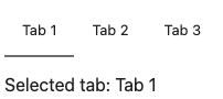
    const Default = () => <Tabs.Root defaultValue="tab1">(<>
            <Tabs.List>
                <Tabs.Tab value="tab1">Tab 1</Tabs.Tab>
                <Tabs.Tab value="tab2">Tab 2</Tabs.Tab>
                <Tabs.Tab value="tab3">Tab 3</Tabs.Tab>
            </Tabs.List>
            <Tabs.Panel value="tab1">
                <ThemedParagraph>Selected tab: Tab 1</ThemedParagraph>
            </Tabs.Panel>
            <Tabs.Panel value="tab2">
                <ThemedParagraph>Selected tab: Tab 2</ThemedParagraph>
            </Tabs.Panel>
            <Tabs.Panel value="tab3">
                <ThemedParagraph>Selected tab: Tab 3</ThemedParagraph>
            </Tabs.Panel>
        </>)</Tabs.Root>;
    

    Minimal

    const Minimal = () => <Tabs.Root>(<>
            <Tabs.List variant="minimal">
                <Tabs.Tab value="tab1">Tab 1</Tabs.Tab>
                <Tabs.Tab value="tab2">Tab 2</Tabs.Tab>
                <Tabs.Tab value="tab3">Tab 3</Tabs.Tab>
            </Tabs.List>
            <Tabs.Panel value="tab1">
                <ThemedParagraph>Selected tab: Tab 1</ThemedParagraph>
            </Tabs.Panel>
            <Tabs.Panel value="tab2">
                <ThemedParagraph>Selected tab: Tab 2</ThemedParagraph>
            </Tabs.Panel>
            <Tabs.Panel value="tab3">
                <ThemedParagraph>Selected tab: Tab 3</ThemedParagraph>
            </Tabs.Panel>
        </>)</Tabs.Root>;
    

    Size And Overflow Playground

    const SizeAndOverflowPlayground = function SizeAndOverflowPlayground( props ) {
        const [ fullWidth, setFullWidth ] = useState( false );
        return (
            <div>
                <div
                    style={ {
                        maxWidth: '40rem',
                        marginBottom: '1rem',
                        color: 'var( --wpds-color-fg-content-neutral )',
                    } }
                >
                    <p>
                        This story helps understand how the TabList component
                        behaves under different conditions. The container below
                        (with the dotted red border) can be horizontally
                        resized, and it has a bit of padding to be out of the
                        way of the TabList.
                    </p>
                    <p>
                        The button will toggle between full width (adding{ ' ' }
                        <code>width: 100%</code>) and the default width.
                    </p>
                    <p>Try the following:</p>
                    <ul>
                        <li>
                            <strong>Small container</strong> that causes tabs to
                            overflow with scroll.
                        </li>
                        <li>
                            <strong>Large container</strong> that exceeds the
                            normal width of the tabs.
                            <ul>
                                <li>
                                    <strong>
                                        With <code>width: 100%</code>
                                    </strong>{ ' ' }
                                    set on the TabList (tabs fill up the space).
                                </li>
                                <li>
                                    <strong>
                                        Without <code>width: 100%</code>
                                    </strong>{ ' ' }
                                    (defaults to <code>auto</code>) set on the
                                    TabList (tabs take up space proportional to
                                    their content).
                                </li>
                            </ul>
                        </li>
                    </ul>
                </div>
                <button
                    style={ { marginBottom: '1rem' } }
                    onClick={ () => setFullWidth( ! fullWidth ) }
                >
                    { fullWidth
                        ? 'Remove width: 100% from TabList'
                        : 'Set width: 100% in TabList' }
                </button>
                <Tabs.Root
                    { ...props }
                    style={ {
                        ...props.style,
                        width: '20rem',
                        border: '2px dotted red',
                        padding: '1rem',
                        resize: 'horizontal',
                        overflow: 'auto',
                    } }
                >
                    <Tabs.List
                        style={ {
                            maxWidth: '100%',
                            width: fullWidth ? '100%' : undefined,
                        } }
                    >
                        <Tabs.Tab value="tab1">
                            Label with multiple words
                        </Tabs.Tab>
                        <Tabs.Tab value="tab2">Short</Tabs.Tab>
                        <Tabs.Tab value="tab3">
                            Hippopotomonstrosesquippedaliophobia
                        </Tabs.Tab>
                        <Tabs.Tab value="tab4">Tab 4</Tabs.Tab>
                        <Tabs.Tab value="tab5">Tab 5</Tabs.Tab>
                    </Tabs.List>
    
                    <Tabs.Panel value="tab1">
                        <ThemedParagraph>Selected tab: Tab 1</ThemedParagraph>
                        <ThemedParagraph>
                            (Label with multiple words)
                        </ThemedParagraph>
                    </Tabs.Panel>
                    <Tabs.Panel value="tab2">
                        <ThemedParagraph>Selected tab: Tab 2</ThemedParagraph>
                        <ThemedParagraph>(Short)</ThemedParagraph>
                    </Tabs.Panel>
                    <Tabs.Panel value="tab3">
                        <ThemedParagraph>Selected tab: Tab 3</ThemedParagraph>
                        <ThemedParagraph>
                            (Hippopotomonstrosesquippedaliophobia)
                        </ThemedParagraph>
                    </Tabs.Panel>
                    <Tabs.Panel value="tab4">
                        <ThemedParagraph>Selected tab: Tab 4</ThemedParagraph>
                    </Tabs.Panel>
                    <Tabs.Panel value="tab5">
                        <ThemedParagraph>Selected tab: Tab 5</ThemedParagraph>
                    </Tabs.Panel>
                </Tabs.Root>
            </div>
        );
    };
    

    Vertical

    const Vertical = () => <Tabs.Root
        orientation="vertical"
        style={{
            minWidth: '320px',
            display: 'grid',
            gridTemplateColumns: '120px 1fr',
            gap: '24px',
        }} />;
    

    With Disabled Tab

    const WithDisabledTab = () => <Tabs.Root defaultValue="tab3">(<>
            <Tabs.List>
                <Tabs.Tab value="tab1" disabled>
                    Tab 1
                </Tabs.Tab>
                <Tabs.Tab value="tab2">Tab 2</Tabs.Tab>
                <Tabs.Tab value="tab3">Tab 3</Tabs.Tab>
            </Tabs.List>
            <Tabs.Panel value="tab1">
                <ThemedParagraph>Selected tab: Tab 1</ThemedParagraph>
            </Tabs.Panel>
            <Tabs.Panel value="tab2">
                <ThemedParagraph>Selected tab: Tab 2</ThemedParagraph>
            </Tabs.Panel>
            <Tabs.Panel value="tab3">
                <ThemedParagraph>Selected tab: Tab 3</ThemedParagraph>
            </Tabs.Panel>
        </>)</Tabs.Root>;
    

    With Tab Icons And Tooltips

    const WithTabIconsAndTooltips = () => <Tabs.Root>(<>
            <Tabs.List>
                { tabWithIconsData.map(
                    ( { value, label, icon: Icon } ) => (
                        <Tooltip.Root key={ value }>
                            <Tooltip.Trigger
                                aria-label={ label }
                                render={ <Tabs.Tab value={ value } /> }
                            >
                                { /* TODO: potentially refactor with new Icon component */ }
                                <Icon
                                    style={ {
                                        width: '20px',
                                        height: '20px',
                                    } }
                                />
                            </Tooltip.Trigger>
                            <Tooltip.Popup
                                positioner={
                                    <Tooltip.Positioner
                                        align="center"
                                        side="top"
                                    />
                                }
                            >
                                { label }
                            </Tooltip.Popup>
                        </Tooltip.Root>
                    )
                ) }
            </Tabs.List>
            { tabWithIconsData.map( ( { value, label } ) => (
                <Tabs.Panel value={ value } key={ value }>
                    <ThemedParagraph>
                        Selected tab: { label }
                    </ThemedParagraph>
                </Tabs.Panel>
            ) ) }
        </>)</Tabs.Root>;
    

    With Panels Always Mounted

    const WithPanelsAlwaysMounted = () => <Tabs.Root>(<>
            <Tabs.List>
                <Tabs.Tab value="tab1">Tab 1</Tabs.Tab>
                <Tabs.Tab value="tab2">Tab 2</Tabs.Tab>
                <Tabs.Tab value="tab3">Tab 3</Tabs.Tab>
            </Tabs.List>
            <Tabs.Panel value="tab1" keepMounted>
                <ThemedParagraph>Selected tab: Tab 1</ThemedParagraph>
            </Tabs.Panel>
            <Tabs.Panel value="tab2" keepMounted>
                <ThemedParagraph>Selected tab: Tab 2</ThemedParagraph>
            </Tabs.Panel>
            <Tabs.Panel value="tab3" keepMounted>
                <ThemedParagraph>Selected tab: Tab 3</ThemedParagraph>
            </Tabs.Panel>
        </>)</Tabs.Root>;
    

    With Non Focusable Panels

    const WithNonFocusablePanels = () => <Tabs.Root>(<>
            <Tabs.List>
                <Tabs.Tab value="tab1">Tab 1</Tabs.Tab>
                <Tabs.Tab value="tab2">Tab 2</Tabs.Tab>
                <Tabs.Tab value="tab3">Tab 3</Tabs.Tab>
            </Tabs.List>
            <Tabs.Panel value="tab1" tabIndex={ -1 }>
                <ThemedParagraph>Selected tab: Tab 1</ThemedParagraph>
                <ThemedParagraph>
                    This tabpanel is not focusable, therefore tabbing into
                    it will focus its first tabbable child.
                </ThemedParagraph>
                <button>Focus me</button>
            </Tabs.Panel>
            <Tabs.Panel value="tab2" tabIndex={ -1 }>
                <ThemedParagraph>Selected tab: Tab 2</ThemedParagraph>
                <ThemedParagraph>
                    This tabpanel is not focusable, therefore tabbing into
                    it will focus its first tabbable child.
                </ThemedParagraph>
                <button>Focus me</button>
            </Tabs.Panel>
            <Tabs.Panel value="tab3" tabIndex={ -1 }>
                <ThemedParagraph>Selected tab: Tab 3</ThemedParagraph>
                <ThemedParagraph>
                    This tabpanel is not focusable, therefore tabbing into
                    it will focus its first tabbable child.
                </ThemedParagraph>
                <button>Focus me</button>
            </Tabs.Panel>
        </>)</Tabs.Root>;
    
  • Panel

    Panel

    Panel expands and collapses multiple sections of content.

    import { Panel } from '@wordpress/components';
    

    View on Storybook

    View in Figma

    View source on GitHub

    Props

    NameDefaultDescription
    header

    PanelHeaderProps[ 'label' ]

    The text that will be rendered as the title of the panel. Text will be rendered inside an <h2> tag.

    className

    string

    The CSS class to apply to the wrapper element.

    children Required

    React.ReactNode

    The content to display within the panel.

    Examples

    Default

    const Default = ( props ) => <Panel { ...props } />;
    

    Panel Row

    PanelRow is a generic container for rows within a PanelBody. It is a flex container with a top margin for spacing.

    const _PanelRow = ( props ) => <Panel { ...props } />;
    

    Disabled Section

    const DisabledSection = ( props ) => <Panel { ...props } />;
    

    With Icon

    const WithIcon = ( props ) => <Panel { ...props } />;
    
  • Stack

    Stack

    A flexible layout component using CSS Flexbox for consistent spacing and alignment. Built on design tokens for predictable spacing values.

    import { Stack } from '@wordpress/ui';
    

    View on Storybook

    View source on GitHub

    Props

    NameDefaultDescription
    className

    string

    CSS class name to apply to the element.

    style

    React.CSSProperties

    CSS style to apply to the element.

    render

    | ComponentRenderFn< HTMLAttributesWithRef > | React.ReactElement< Record< string, unknown > >

    Replaces the component’s default HTML element using a given React element, or a function that returns a React element.

    direction

    Exclude< React.CSSProperties[ 'flexDirection' ], 'row-reverse' | 'column-reverse' >

    The direction of the stack.

    gap

    GapSize

    The amount of space between each child element using design system tokens.

    align

    React.CSSProperties[ 'alignItems' ]

    The alignment of the stack items along the cross axis.

    justify

    React.CSSProperties[ 'justifyContent' ]

    The alignment of the stack items along the main axis.

    wrap

    Exclude< React.CSSProperties[ 'flexWrap' ], 'wrap-reverse' >

    Whether the stack items should wrap to the next line.

    children

    React.ReactNode

    The content to be rendered inside the component.

    Examples

    Default

    const Default = () => <Stack gap="md">(<>
            <DemoBox />
            <DemoBox variant="lg" />
            <DemoBox />
            <DemoBox />
            <DemoBox variant="lg" />
            <DemoBox />
        </>)</Stack>;
    

    Nested

    const Nested = () => <Stack align="center" justify="center">(<>
            <DemoBox variant="lg" />
            <Stack gap="lg">
                <DemoBox />
                <DemoBox />
            </Stack>
            <DemoBox variant="lg" />
            <Stack direction="column">
                <DemoBox />
                <DemoBox />
            </Stack>
            <DemoBox variant="lg" />
        </>)</Stack>;
    
  • Card

    Card

    A visually contained surface that groups related content and actions.

    import { Card } from '@wordpress/ui';
    

    View on Storybook

    View source on GitHub

    Props

    NameDefaultDescription
    className

    string

    CSS class name to apply to the element.

    style

    React.CSSProperties

    CSS style to apply to the element.

    render

    | ComponentRenderFn< HTMLAttributesWithRef > | React.ReactElement< Record< string, unknown > >

    Replaces the component’s default HTML element using a given React element, or a function that returns a React element.

    children

    ReactNode

    The content to be rendered inside the card.

    Examples

    Default

    const Default = () => <Card.Root>(<>
            <Card.Header>
                <Card.Title>Card title</Card.Title>
            </Card.Header>
            <Card.Content>
                <Text>
                    This is the main content area. It can contain any
                    elements. This is the main content area. It can contain
                    any elements. This is the main content area. It can
                    contain any elements. This is the main content area. It
                    can contain any elements. This is the main content area.
                    It can contain any elements. This is the main content
                    area. It can contain any elements.
                </Text>
                <Text>
                    This is the main content area. It can contain any
                    elements.
                </Text>
            </Card.Content>
        </>)</Card.Root>;
    

    Full Bleed Cover Only

    Card.FullBleed as the sole child of Card.Content spans edge-to-edge with no padding around it.

    const FullBleedCoverOnly = () => <Card.Root>(<Card.Content>
            <Card.FullBleed>
                <div
                    style={ {
                        height: 180,
                        background:
                            'linear-gradient(135deg, #f093fb 0%, #f5576c 100%)',
                    } }
                />
            </Card.FullBleed>
        </Card.Content>)</Card.Root>;
    

    Full Bleed Cover With Header

    When Card.FullBleed is the sole child of Card.Content and a Card.Header sits above it, the image bumps against the card’s side and bottom edges while the header retains its normal padding.

    const FullBleedCoverWithHeader = () => <Card.Root>(<>
            <Card.Header>
                <Card.Title>Card title</Card.Title>
            </Card.Header>
            <Card.Content>
                <Card.FullBleed>
                    <div
                        style={ {
                            height: 180,
                            background:
                                'linear-gradient(135deg, #f093fb 0%, #f5576c 100%)',
                        } }
                    />
                </Card.FullBleed>
            </Card.Content>
        </>)</Card.Root>;
    

    With Full Bleed

    Card.FullBleed breaks out of the card’s padding to span edge-to-edge. Useful for images, dividers, or embedded content.

    const WithFullBleed = () => <Card.Root>(<>
            <Card.Header>
                <Card.Title>Featured image</Card.Title>
            </Card.Header>
            <Card.Content render={ <Stack direction="column" gap="lg" /> }>
                <Card.FullBleed>
                    <div
                        style={ {
                            height: 160,
                            background:
                                'linear-gradient(135deg, #667eea 0%, #764ba2 100%)',
                        } }
                    />
                </Card.FullBleed>
                <Text>Content below the full-bleed area.</Text>
            </Card.Content>
        </>)</Card.Root>;
    

    Header Only

    A minimal card with only a header.

    const HeaderOnly = () => <Card.Root>(<Card.Header>
            <Card.Title>Simple card</Card.Title>
        </Card.Header>)</Card.Root>;
    

    Full Bleed Hero With Title

    When Card.FullBleed is the first child of Card.Header, it extends flush to the card’s top and side edges — ideal for hero images. Content that follows inside the header is padded normally.

    const FullBleedHeroWithTitle = () => <Card.Root>(<>
            <Card.Header render={ <Stack direction="column" gap="lg" /> }>
                <Card.FullBleed>
                    <div
                        style={ {
                            height: 180,
                            background:
                                'linear-gradient(135deg, #f093fb 0%, #f5576c 100%)',
                        } }
                    />
                </Card.FullBleed>
                <Card.Title>Hero image card</Card.Title>
            </Card.Header>
            <Card.Content>
                <Text>
                    The image above bleeds to the card&apos;s top and side
                    edges.
                </Text>
            </Card.Content>
        </>)</Card.Root>;
    

    Full Bleed Hero Only

    When Card.FullBleed is the only child of Card.Header, it fills the header entirely — top and sides flush to the card edges, no extra padding below.

    const FullBleedHeroOnly = () => <Card.Root>(<>
            <Card.Header>
                <Card.FullBleed>
                    <div
                        style={ {
                            height: 180,
                            background:
                                'linear-gradient(135deg, #f093fb 0%, #f5576c 100%)',
                        } }
                    />
                </Card.FullBleed>
            </Card.Header>
            <Card.Content>
                <Text>
                    The image above bleeds to the card&apos;s top and side
                    edges.
                </Text>
            </Card.Content>
        </>)</Card.Root>;
    

    Custom Semantics

    Use the render prop to change the underlying HTML elements for better semantics. Here, Card.Root renders as a <section> and Card.Title renders as an <h2>.

    const CustomSemantics = () => <Card.Root render={<section />}>(<>
            <Card.Header>
                <Card.Title render={ <h2 /> }>Section heading</Card.Title>
            </Card.Header>
            <Card.Content>
                <Text>Semantically meaningful card content.</Text>
            </Card.Content>
        </>)</Card.Root>;
    
  • Collapsible

    Collapsible

    Groups all parts of the collapsible.

    Collapsible is a collection of React components that combine to render a collapsible panel controlled by a button.

    import { Collapsible } from '@wordpress/ui';
    

    View on Storybook

    View source on GitHub

    Props

    NameDefaultDescription
    className

    string

    CSS class name to apply to the element.

    style

    React.CSSProperties

    CSS style to apply to the element.

    render

    | ComponentRenderFn< HTMLAttributesWithRef > | React.ReactElement< Record< string, unknown > >

    Replaces the component’s default HTML element using a given React element, or a function that returns a React element.

    children

    ReactNode

    The content to be rendered inside the component.

    Examples

    Default

    const Default = () => <Collapsible.Root>(<>
            <Collapsible.Trigger>Toggle</Collapsible.Trigger>
            <Collapsible.Panel>
                <p>Collapsible content here.</p>
            </Collapsible.Panel>
        </>)</Collapsible.Root>;
    

    Default Open

    const DefaultOpen = () => <Collapsible.Root defaultOpen>(<>
            <Collapsible.Trigger>Toggle</Collapsible.Trigger>
            <Collapsible.Panel>
                <p>This panel is open by default.</p>
            </Collapsible.Panel>
        </>)</Collapsible.Root>;
    

    Disabled

    const Disabled = () => <Collapsible.Root disabled>(<>
            <Collapsible.Trigger>Toggle (disabled)</Collapsible.Trigger>
            <Collapsible.Panel>
                <p>This content cannot be toggled.</p>
            </Collapsible.Panel>
        </>)</Collapsible.Root>;
    

    Hidden Until Found

    When hiddenUntilFound is set on Collapsible.Panel, the collapsed content remains in the DOM using the hidden="until-found" HTML attribute instead of being removed entirely. This lets the browser’s native page search (Ctrl/Cmd+F) find text inside collapsed panels and automatically expand them to reveal the match — improving discoverability without sacrificing the collapsed layout.

    const HiddenUntilFound = function HiddenUntilFound() {
        return (
            <div>
                <p>
                    Use the browser&apos;s find-in-page (Ctrl/Cmd+F) to search
                    for "hidden treasure". The collapsed panel will
                    automatically expand to reveal the match.
                </p>
                <Collapsible.Root>
                    <Collapsible.Trigger>Expand to reveal</Collapsible.Trigger>
                    <Collapsible.Panel hiddenUntilFound>
                        <p>
                            This is the hidden treasure that can be found via
                            the browser&apos;s built-in page search even while
                            the panel is collapsed.
                        </p>
                    </Collapsible.Panel>
                </Collapsible.Root>
            </div>
        );
    };
    

    Controlled

    const Controlled = function Controlled() {
        const [ open, setOpen ] = useState( false );
        return (
            <Collapsible.Root open={ open } onOpenChange={ setOpen }>
                <Collapsible.Trigger>
                    { open ? 'Close' : 'Open' }
                </Collapsible.Trigger>
                <Collapsible.Panel>
                    <p>Controlled collapsible panel.</p>
                </Collapsible.Panel>
            </Collapsible.Root>
        );
    };
    
  • CollapsibleCard

    CollapsibleCard

    A card that can be expanded and collapsed. When collapsed, only the header is visible.

    import { CollapsibleCard } from '@wordpress/ui';
    

    View on Storybook

    View source on GitHub

    Props

    NameDefaultDescription
    className

    string

    CSS class name to apply to the element.

    style

    React.CSSProperties

    CSS style to apply to the element.

    render

    | ComponentRenderFn< HTMLAttributesWithRef > | React.ReactElement< Record< string, unknown > >

    Replaces the component’s default HTML element using a given React element, or a function that returns a React element.

    children

    ReactNode

    The content to be rendered inside the collapsible card. Should include CollapsibleCard.Header and CollapsibleCard.Content.

    open

    boolean

    Whether the collapsible panel is currently open (controlled).

    To render an uncontrolled collapsible card, use defaultOpen instead.

    defaultOpen

    boolean

    Whether the collapsible panel is initially open (uncontrolled).

    onOpenChange

    ( open: boolean ) => void

    Event handler called when the panel is opened or closed.

    disabled

    boolean

    Whether the component should ignore user interaction.

    Examples

    Default

    A collapsible card that is open by default.

    const Default = () => <CollapsibleCard.Root>(<>
            <CollapsibleCard.Header>
                <Card.Title>
                    Collapsible card (closed by default)
                </Card.Title>
            </CollapsibleCard.Header>
            <CollapsibleCard.Content>
                <Text>
                    This is the collapsible content area. It can contain any
                    elements, just like a regular Card.Content.
                </Text>
                <Text>
                    When collapsed, only the header and chevron are visible.
                </Text>
            </CollapsibleCard.Content>
        </>)</CollapsibleCard.Root>;
    

    Initially Opened

    A collapsible card that starts collapsed.

    const InitiallyOpened = () => <CollapsibleCard.Root defaultOpen>(<>
            <CollapsibleCard.Header>
                <Card.Title>Collapsed by default</Card.Title>
            </CollapsibleCard.Header>
            <CollapsibleCard.Content>
                <Text>This content was hidden until you expanded it.</Text>
            </CollapsibleCard.Content>
        </>)</CollapsibleCard.Root>;
    

    Disabled

    A disabled collapsible card cannot be toggled by the user.

    const Disabled = () => <CollapsibleCard.Root disabled>(<>
            <CollapsibleCard.Header>
                <Card.Title>Disabled card</Card.Title>
            </CollapsibleCard.Header>
            <CollapsibleCard.Content>
                <Text>The header is not interactive when disabled.</Text>
            </CollapsibleCard.Content>
        </>)</CollapsibleCard.Root>;
    

    Stacked

    Multiple collapsible cards stacked vertically, simulating a typical settings-panel or FAQ-style layout.

    const Stacked = () => (
        <div
            style={ {
                display: 'flex',
                flexDirection: 'column',
                gap: 'var(--wpds-dimension-gap-lg)',
            } }
        >
            { [
                'General',
                'Advanced',
                'Accessibility',
                'Performance',
                'Privacy',
                'Notifications',
            ].map( ( title ) => (
                <CollapsibleCard.Root key={ title }>
                    <CollapsibleCard.Header>
                        <Card.Title>{ title }</Card.Title>
                    </CollapsibleCard.Header>
                    <CollapsibleCard.Content>
                        <Text>
                            Configure all { title.toLowerCase() } settings for
                            your site. Changes here affect how your site behaves
                            across all pages and posts.
                        </Text>
                        <Text>
                            Review each option carefully before saving. Some
                            changes may require a page reload to take effect.
                            Hover over individual options for more details about
                            what they control.
                        </Text>
                        <Text>
                            If you&apos;re unsure about a setting, you can
                            always reset to defaults using the button at the
                            bottom of this section. Your previous configuration
                            will be saved as a backup.
                        </Text>
                    </CollapsibleCard.Content>
                </CollapsibleCard.Root>
            ) ) }
        </div>
    );
    

    With Heading Element

    CollapsibleCard.Header renders a <div> wrapper by default. Pass an <h1><h6> React element to the render prop to wrap the trigger in a heading and contribute to the document outline. The right level depends on the surrounding outline, so the consumer is expected to opt in.

    const WithHeadingElement = () => (
        <div
            style={ {
                display: 'flex',
                flexDirection: 'column',
                gap: 'var(--wpds-dimension-gap-lg)',
            } }
        >
            <CollapsibleCard.Root>
                <CollapsibleCard.Header render={ <h2 /> }>
                    <Card.Title>Heading level 2</Card.Title>
                </CollapsibleCard.Header>
                <CollapsibleCard.Content>
                    <Text>
                        The wrapper renders as an h2 element when the consumer
                        passes an h2 React element to the render prop.
                    </Text>
                </CollapsibleCard.Content>
            </CollapsibleCard.Root>
            <CollapsibleCard.Root>
                <CollapsibleCard.Header render={ <h3 /> }>
                    <Card.Title>Heading level 3</Card.Title>
                </CollapsibleCard.Header>
                <CollapsibleCard.Content>
                    <Text>
                        Pass any of h1–h6 to choose the level that fits the
                        surrounding document outline.
                    </Text>
                </CollapsibleCard.Content>
            </CollapsibleCard.Root>
            <CollapsibleCard.Root>
                <CollapsibleCard.Header>
                    <Card.Title>No heading (default)</Card.Title>
                </CollapsibleCard.Header>
                <CollapsibleCard.Content>
                    <Text>
                        Without a render prop, the header wraps the trigger in a
                        plain div and does not contribute to the document
                        outline.
                    </Text>
                </CollapsibleCard.Content>
            </CollapsibleCard.Root>
        </div>
    );
    

    With Header Description

    A collapsible card with a HeaderDescription that provides supplementary information (e.g. status, summary) as an aria-describedby relationship.

    const WithHeaderDescription = ( { open, defaultOpen, onOpenChange, disabled, ...restArgs } ) => (
        <CollapsibleCard.Root
            open={ open }
            defaultOpen={ defaultOpen }
            onOpenChange={ onOpenChange }
            disabled={ disabled }
            { ...restArgs }
        >
            <CollapsibleCard.Header>
                <Stack justify="space-between">
                    <Card.Title>Settings</Card.Title>
                    <CollapsibleCard.HeaderDescription>
                        <span
                            style={ {
                                fontSize: 'var(--wpds-typography-font-size-sm)',
                                color: 'var(--wpds-color-fg-content-neutral-weak)',
                            } }
                        >
                            3 items configured
                        </span>
                    </CollapsibleCard.HeaderDescription>
                </Stack>
            </CollapsibleCard.Header>
            <CollapsibleCard.Content>
                <Text>
                    The header description provides supplementary context to the
                    trigger button. Assistive technologies will announce the
                    description alongside the button label.
                </Text>
            </CollapsibleCard.Content>
        </CollapsibleCard.Root>
    );
    

    Compared To Card

    Visual comparison: a CollapsibleCard (open) next to a regular Card to verify identical spacing and layout.

    const ComparedToCard = ( { open, defaultOpen, onOpenChange, disabled, ...restArgs } ) => (
        <div
            style={ {
                display: 'flex',
                flexDirection: 'column',
                gap: 'var( --wpds-dimension-gap-lg )',
            } }
        >
            <CollapsibleCard.Root
                open={ open }
                defaultOpen={ defaultOpen }
                onOpenChange={ onOpenChange }
                disabled={ disabled }
                { ...restArgs }
            >
                <CollapsibleCard.Header>
                    <Card.Title>CollapsibleCard (open)</Card.Title>
                </CollapsibleCard.Header>
                <CollapsibleCard.Content>
                    <Text>
                        Content should align with the regular card below.
                    </Text>
                </CollapsibleCard.Content>
            </CollapsibleCard.Root>
            <Card.Root { ...restArgs }>
                <Card.Header>
                    <Card.Title>Regular Card</Card.Title>
                </Card.Header>
                <Card.Content>
                    <Text>
                        Content should align with the collapsible card above.
                    </Text>
                </Card.Content>
            </Card.Root>
        </div>
    );
    

    Full Bleed Cover With Header

    When Card.FullBleed is the sole child of CollapsibleCard.Content and a header sits above it, the media bumps against the card&apos;s side and bottom edges while the header retains its normal padding. (Unlike a plain Card, a header is always required here for the collapse trigger — see Card stories for a body-only FullBleedCoverOnly example.)

    const FullBleedCoverWithHeader = () => <CollapsibleCard.Root defaultOpen>(<>
            <CollapsibleCard.Header>
                <Card.Title>Card title</Card.Title>
            </CollapsibleCard.Header>
            <CollapsibleCard.Content>
                <Card.FullBleed>
                    <div
                        style={ {
                            height: 180,
                            background:
                                'linear-gradient(135deg, #f093fb 0%, #f5576c 100%)',
                        } }
                    />
                </Card.FullBleed>
            </CollapsibleCard.Content>
        </>)</CollapsibleCard.Root>;
    

    With Full Bleed

    Card.FullBleed breaks out of the content padding to span edge-to-edge. Useful for images, dividers, or embedded content inside the collapsible region.

    const WithFullBleed = () => <CollapsibleCard.Root defaultOpen>(<>
            <CollapsibleCard.Header>
                <Card.Title>Featured image</Card.Title>
            </CollapsibleCard.Header>
            <CollapsibleCard.Content
                render={ <Stack direction="column" gap="lg" /> }
            >
                <Card.FullBleed>
                    <div
                        style={ {
                            height: 160,
                            background:
                                'linear-gradient(135deg, #667eea 0%, #764ba2 100%)',
                        } }
                    />
                </Card.FullBleed>
                <Text>Content below the full-bleed area.</Text>
            </CollapsibleCard.Content>
        </>)</CollapsibleCard.Root>;
    
  • ItemGroup

    ItemGroup

    import { __experimentalItemGroup as ItemGroup } from '@wordpress/components';
    

    View on Storybook

    View in Figma

    View source on GitHub

    Examples

    Default

    const Default = ( props ) => (
    	<ItemGroup { ...props } />
    );
    

    Non Clickable Items

    const NonClickableItems = ( props ) => (
    	<ItemGroup { ...props } />
    );
    

    Custom Item Size

    const CustomItemSize = ( props ) => (
    	<ItemGroup { ...props } />
    );
    

    Without Border

    const WithoutBorder = ( props ) => (
    	<ItemGroup { ...props } />
    );